Making content stand out from the crowd is one of the biggest challenges for bloggers and content creators.
When you first start out ( and even when you’ve been going for years ) finding ways to get your content noticed can be immensely frustrating, but don’t get downhearted. Little and often is better than nothing and don’t be afraid to change what you’re doing. Social media platforms often change what type of post they favour so just because something works well one month doesn’t mean it’ll be the same the next, but if you persevere you will get there.
A large proportion of my traffic comes from Pinterest where a stand out image is essential. Likewise for other social media platforms, a good image can make all the difference. So, how can you make your content stand out?
Top tips for making stand out blog and Pinterest images
- Use a photo editor. Canva and Picmonkey both include free templates and have a large selection of photos and graphics you can use. You do have to pay for premium features, but for me it’s definitely been worth it. I especially love the ability to remove the background from an image.
- Make a video pin. Canva allows users to make images with videos embedded, which is a great tool for making a stand out, eye catching image for Pinterest.
- Use your own fonts! Rather than just using the standard fonts which come with each editing tool and are highly recognisable, choose your own free fonts to help you really stand out! Using your own fonts allows you to create a constant unique look for your brand. Picmonkey and Canva make adding free fonts super easy and once uploaded they’re always there in the font selection box whenever you need them.
- Use the correct size image for the platform you’re using. Picmonkey and Canva make it easy to create images that are perfectly sized for whatever social media you need it for. A large pin image for example doesn’t look great on Facebook and Instagram needs a specific size image to avoid cropping when you use it. My top timesaving tip is to create images for all the social media platforms you use at the same time. PicMonkey has a handy resize tool which allows you to keep the text and images you’ve already used, but resizes the background so you just need to quickly adjust the sizes of everything else to create another fantastic image.
- Don’t use too much text, you need just enough to make it obvious what the blog post is about, but not so much it’s overwhelming.
- Make the text easy to read. A good sized, clear font is best.
- Don’t forget mobile users! Always check your image looks as good on mobile as it does on a big screen, especially if you’ve used text!
- Try something different. Long, thin infographics work well on Pinterest, but again remember to make sure your text is easily visible.
- Use stock images, using stock images can save you hours of time taking your own photos.
- Add your logo to images, this tells people straight away what your website or blog is and helps build your brand! It’s free marketing, use it!
- Don’t forget to interact with people from your niche, share content and consider joining group boards too.
- Finally, remember key words and hashtags, both great for helping Google and Pinterest find YOUR content when people search.
How to add your own fonts in Picmonkey
Simply choose text and then the ‘upload own font’ option from the drop down menu.
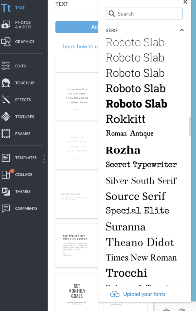
Once you’ve uploaded them, they’ll be there whenever you need them on whatever computer you use!
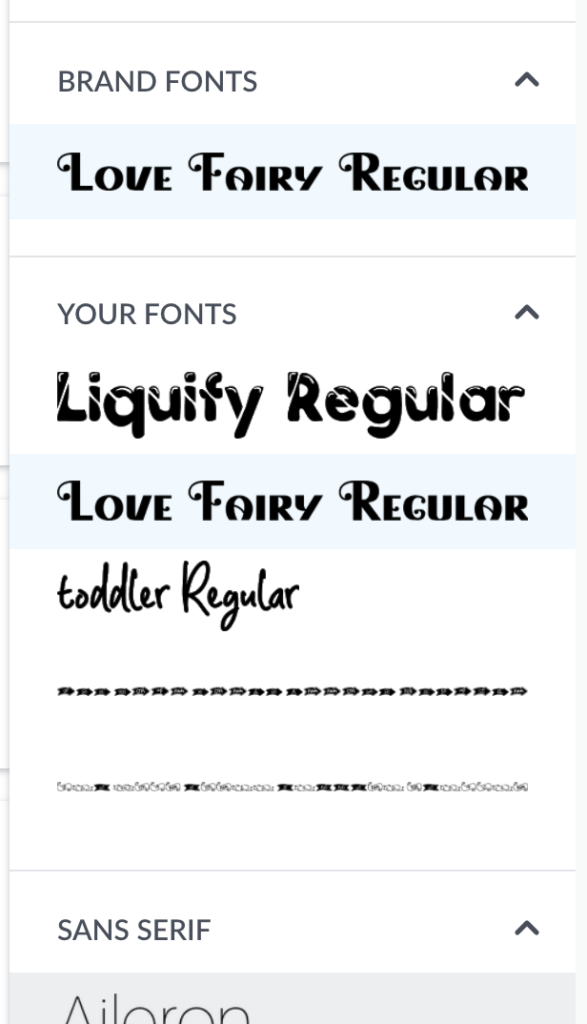
Using your own fonts is a great way to get yourself noticed and help people recognise YOUR content.
How to make a great Pinterest image
They key to making a great Pinterest image is to make it eye catching enough for someone to notice as they scroll down their feed. There are 100s of similar crafts and recipes so standing out is essential.
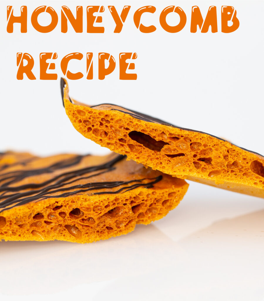
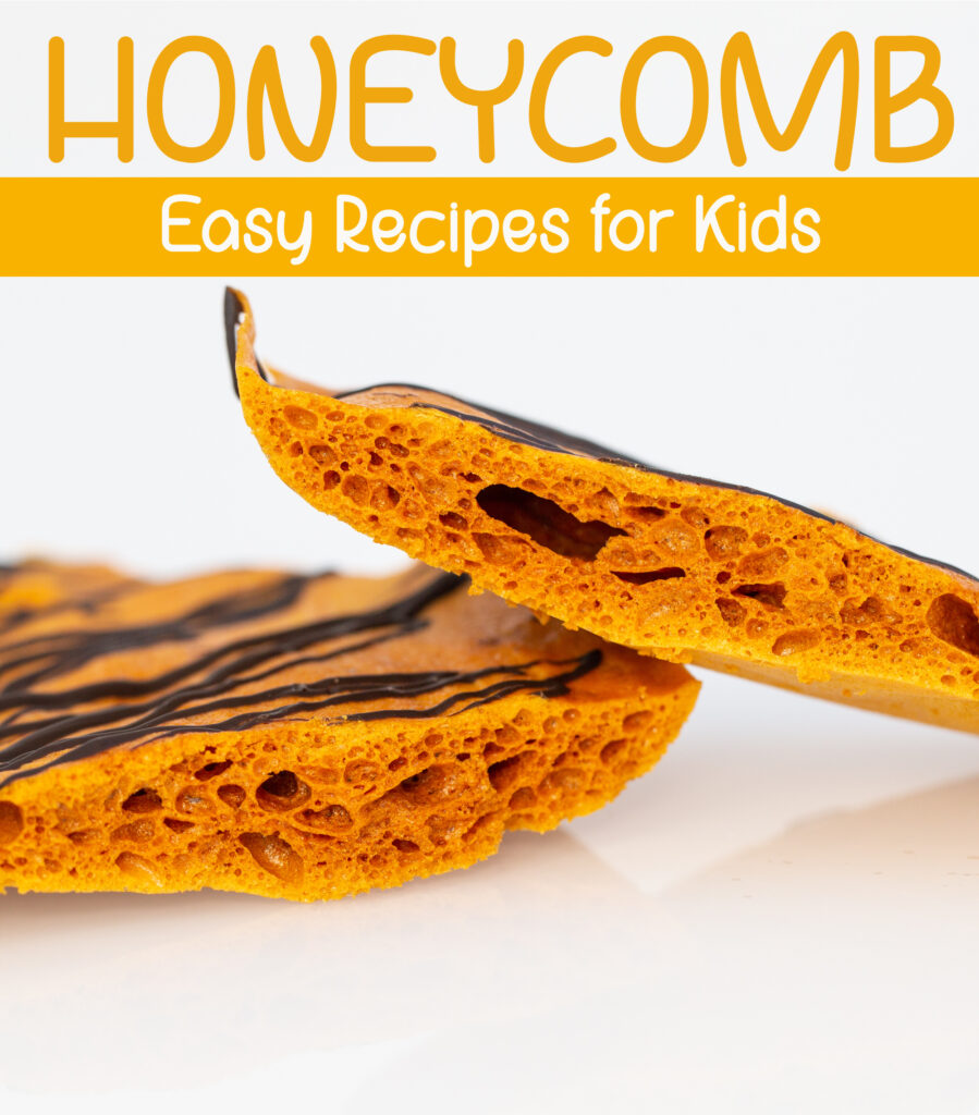
I’ve used a simple image on a plain background to show you the impact of adding text to your images.
This image using a font called liquify that I downloaded and them added to Picmonkey. You can see how it instantly makes it very clear what the blog post is about.
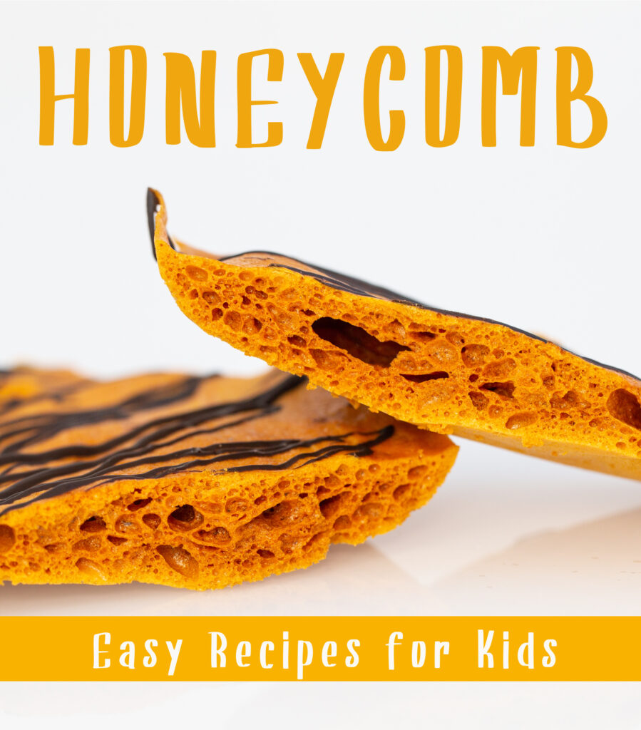
This is a slight variation on the theme, with a different font.
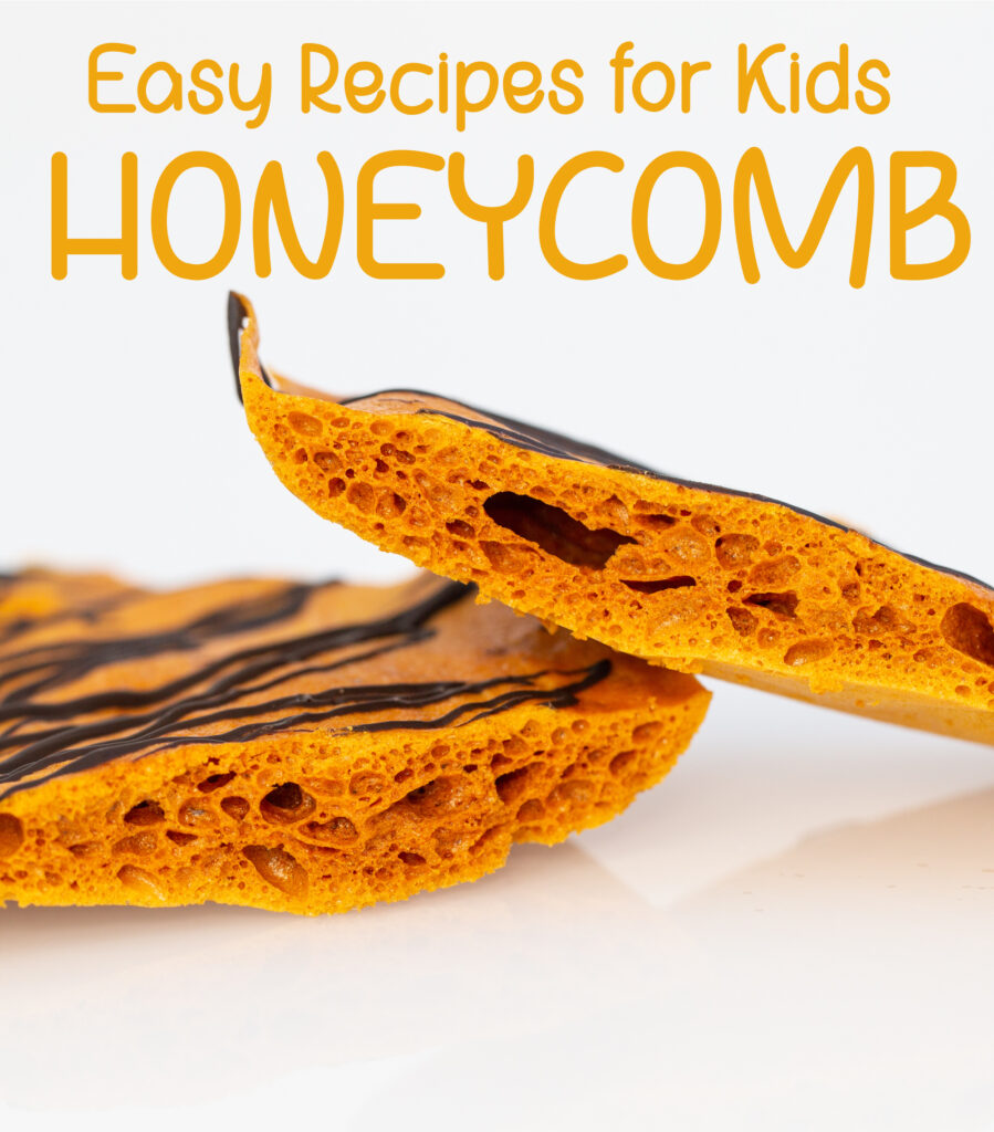
I’ve added another twist on the images below by using a box to place some of the text inside. You can see how the fonts change the entire look of the image.
What do you think? Which apps do you use to make a great Pinterest image and what type of image works best for you?
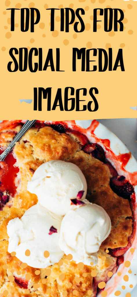
Collaborative Post






Leave a Reply